St..Cloud,.Minnesota
A comprehensive branding system empowering St. Cloud’s growth, visibility and livability.
✴︎ Community
-
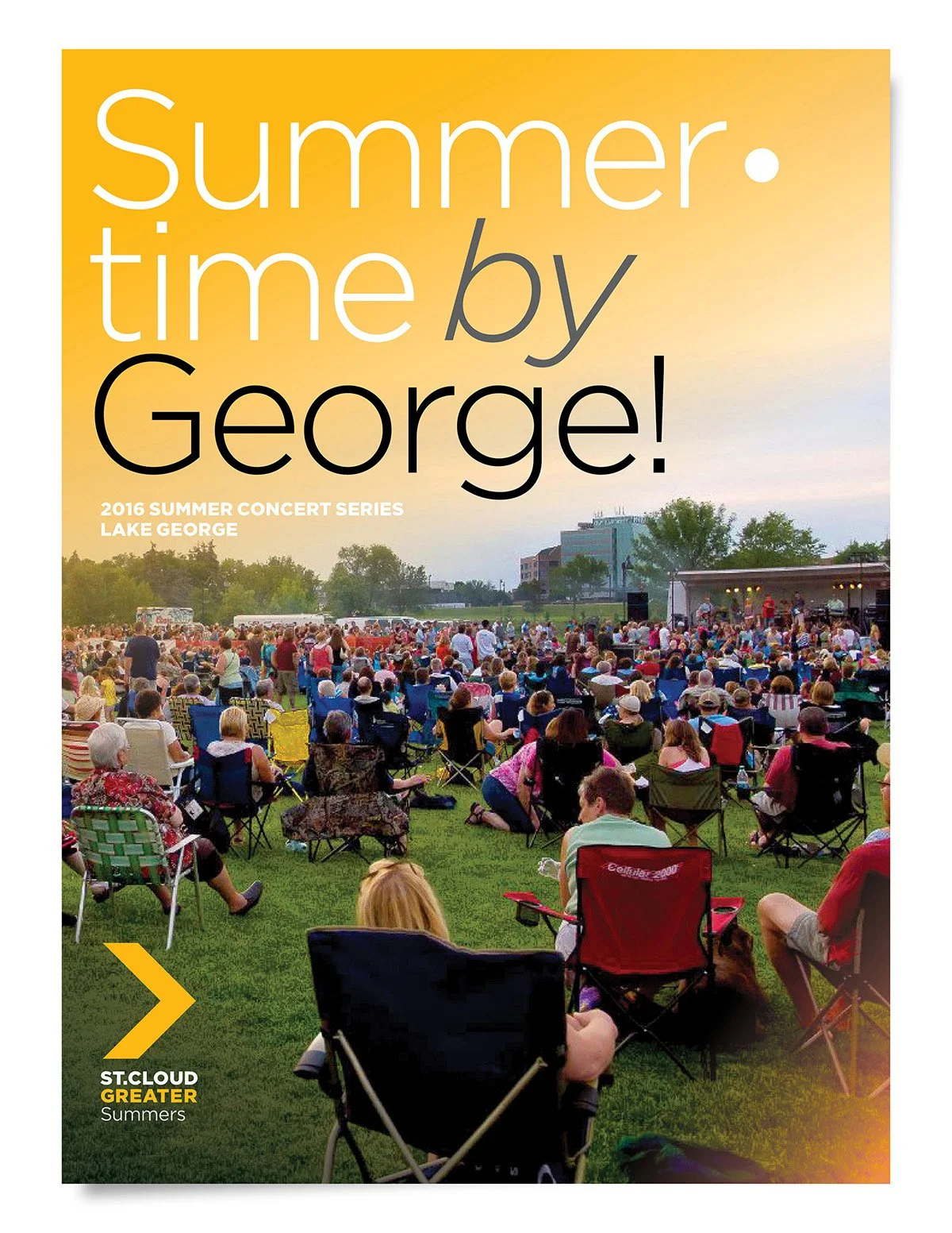
St. Cloud, Minnesota is a city of remarkable assets: a prime location at the crossroads of the Mississippi River, a thriving manufacturing base, world-class healthcare, and one of the state's fastest-growing labor forces. The assignment was to build a brand identity system powerful and comprehensive enough to bring all of that to life across an entire community.
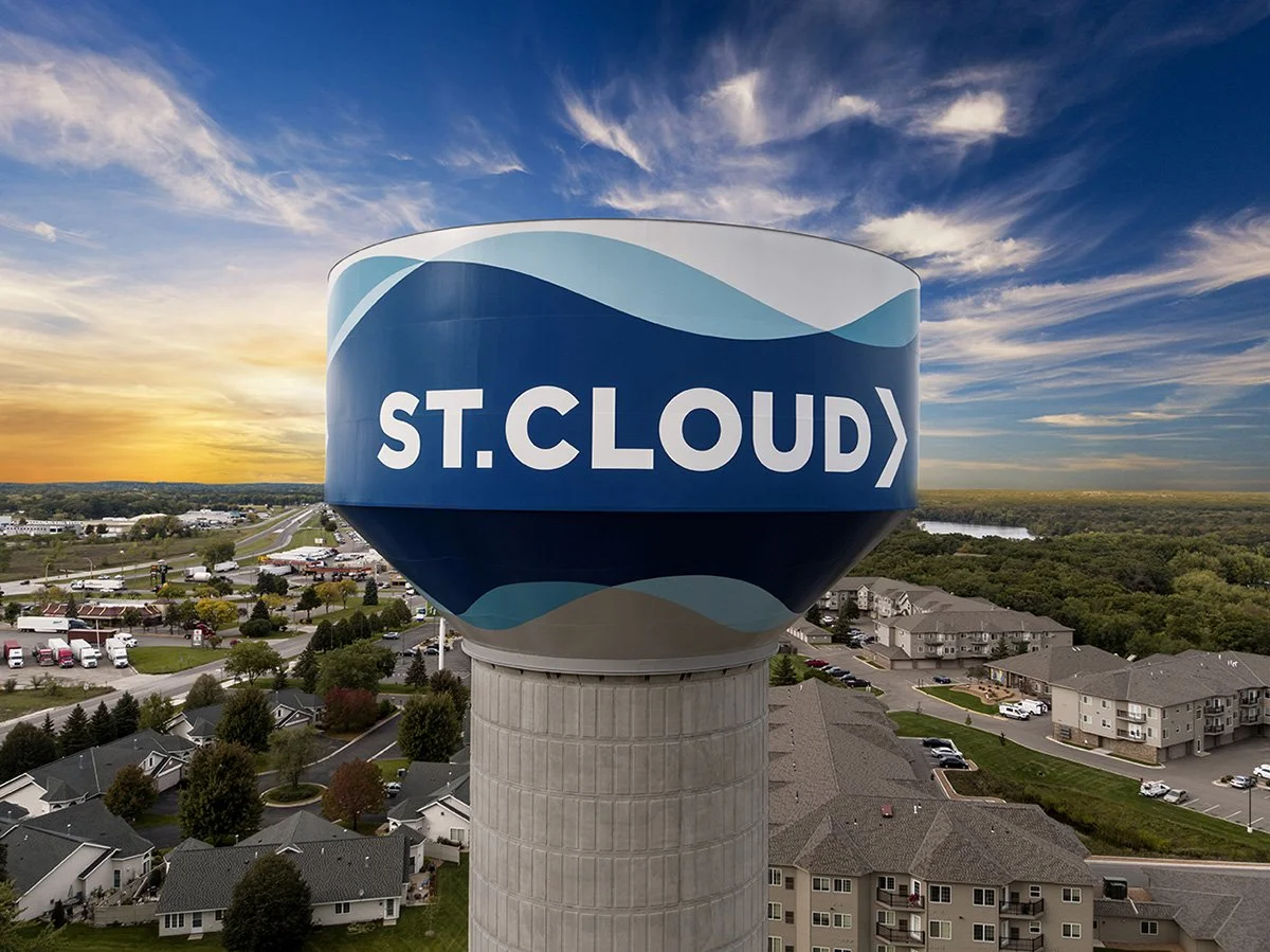
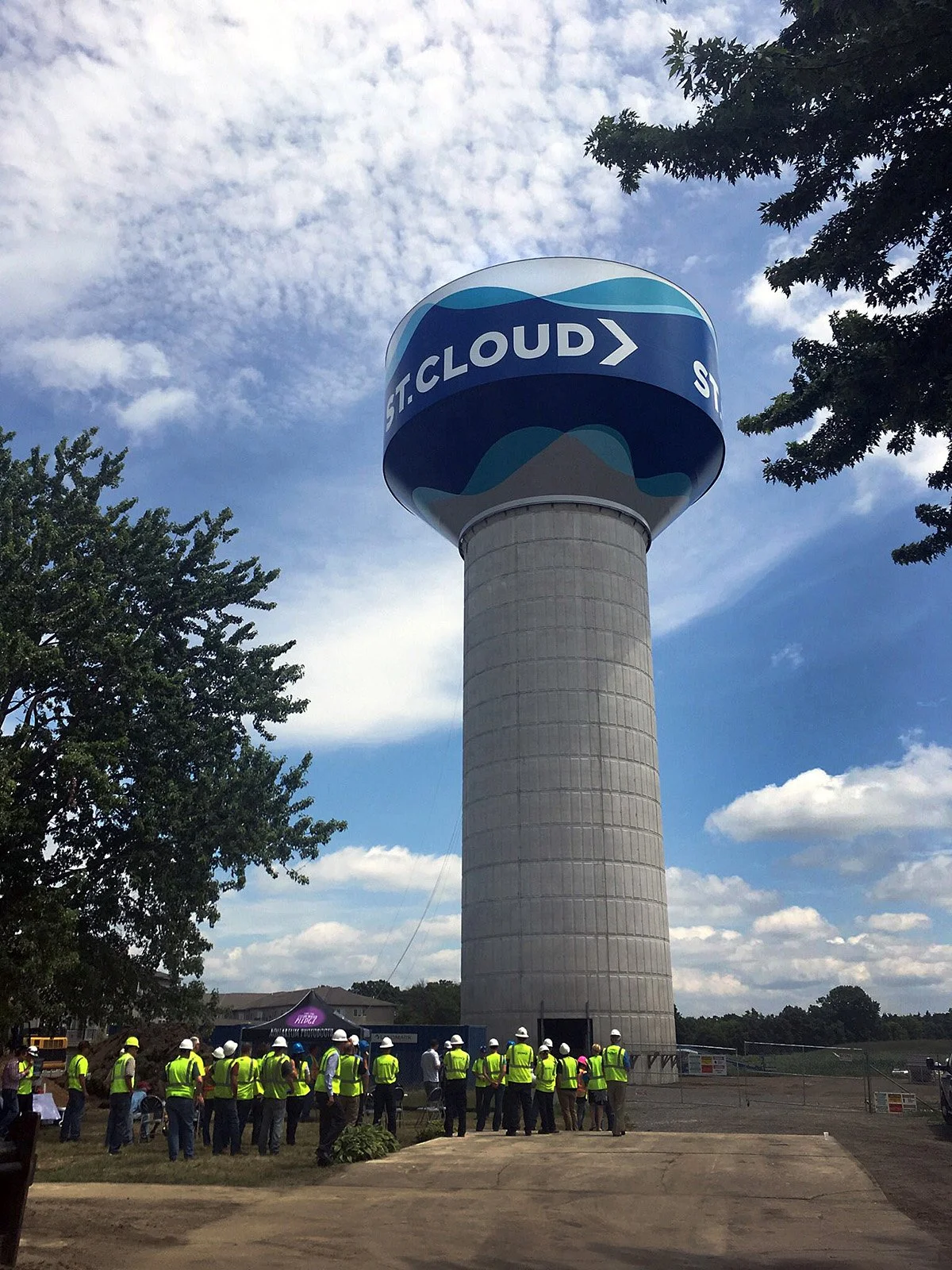
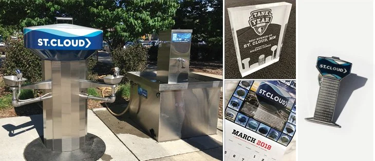
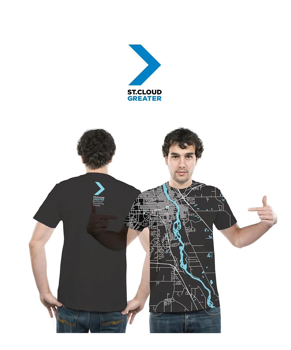
Sparq worked closely alongside landscape architects and planners The Lakota Group and the City's own Mayor's Office through an intensive placemaking process that brought residents, business leaders, and civic stakeholders together around a shared question: what makes St. Cloud genuinely, distinctively itself? From that process came both an insight and a rallying cry: GREATER. A single word capturing the city's scale, ambition, and spirit all at once. The visual identity anchored that idea in a bold chevron/arrow mark versatile enough to travel from a lapel pin to the curved surface of a two-million-gallon water tower. Wrapped in deep navy with flowing wave graphics evoking the Mississippi River, the tower became an instantly recognizable civic landmark and a daily reminder of the community's shared sense of purpose, earning recognition as a Tnemec Tank of the Year in 2017.
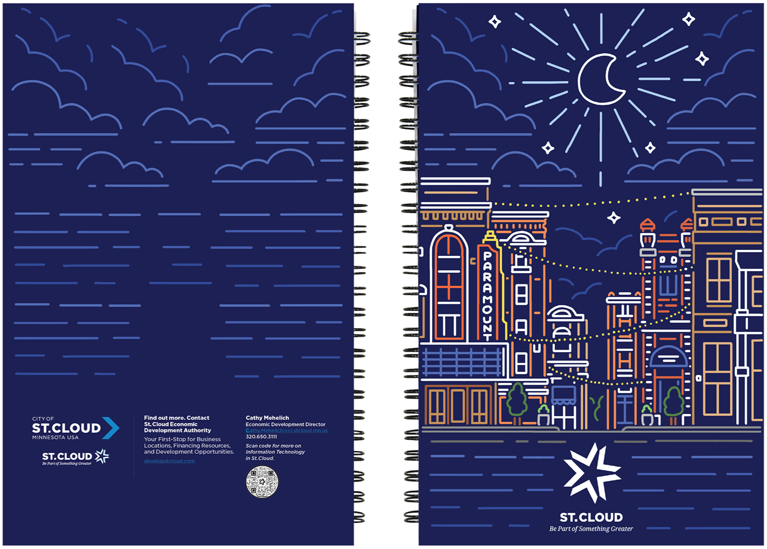
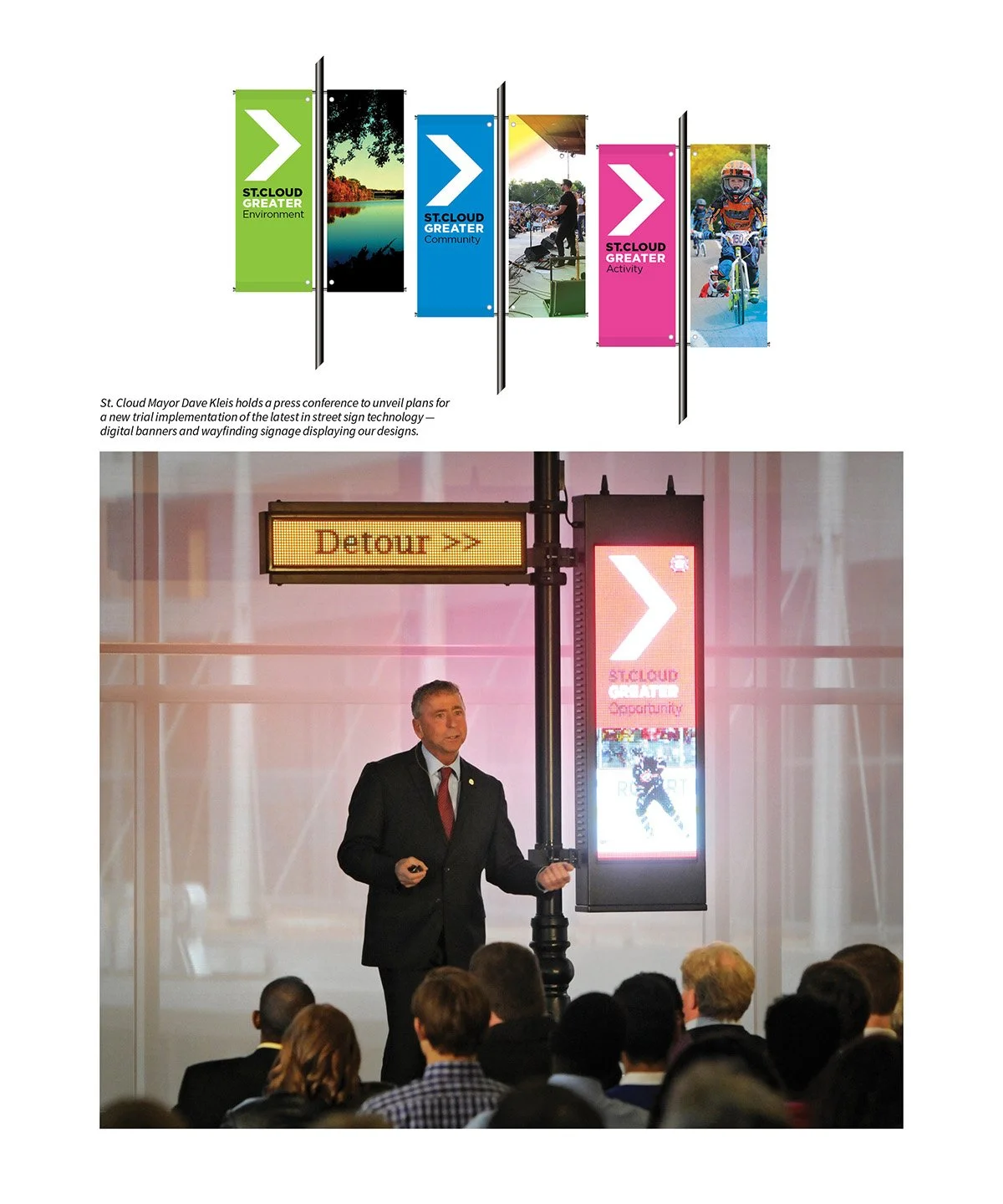
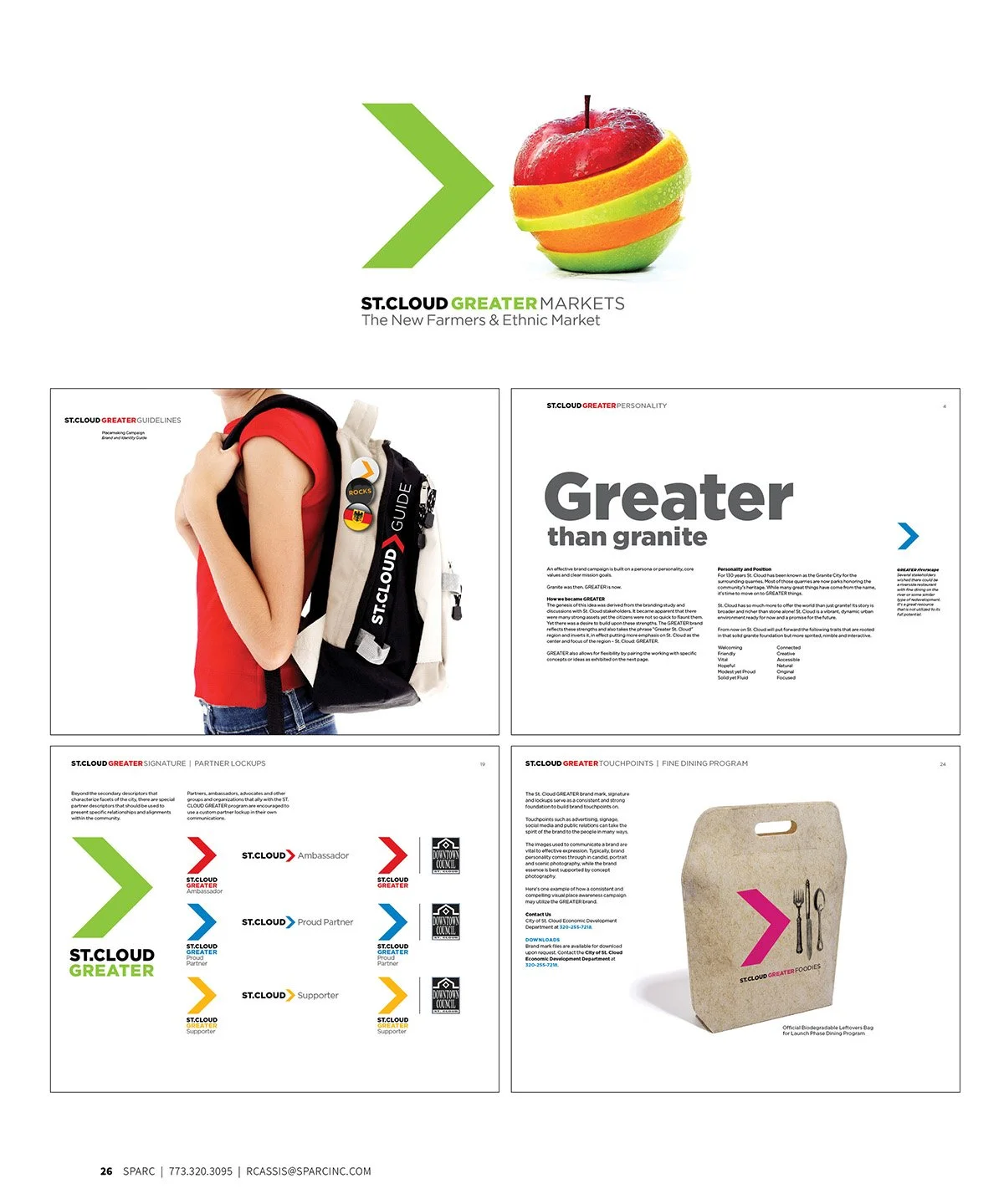
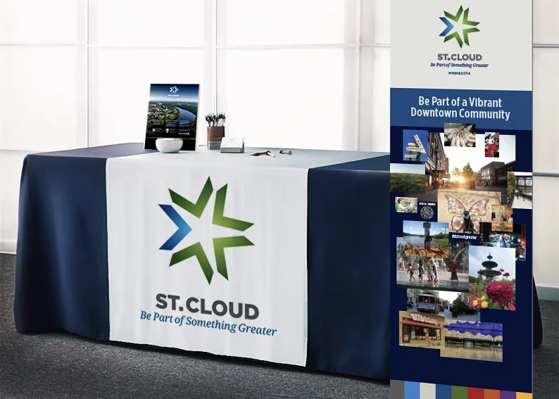
The brand system that followed touched every dimension of the city's public presence. A comprehensive street banner program deployed the GREATER identity across the city's corridors, with color-coded banners organized around distinct civic themes including Environment, Community, Activity, and Opportunity, each pairing the bold chevron mark with vivid photography celebrating St. Cloud's landscapes, people, and energy. The system extended into digital street signage as well, with LED displays carrying the GREATER identity into real-time wayfinding and event communications, a program significant enough that Mayor Dave Kleis held a dedicated press conference to introduce the technology to the community.
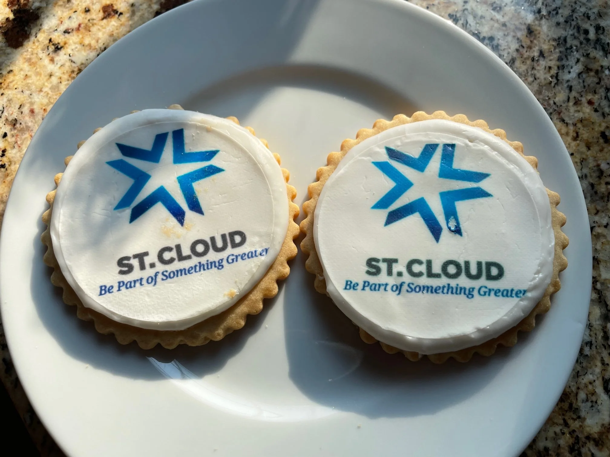
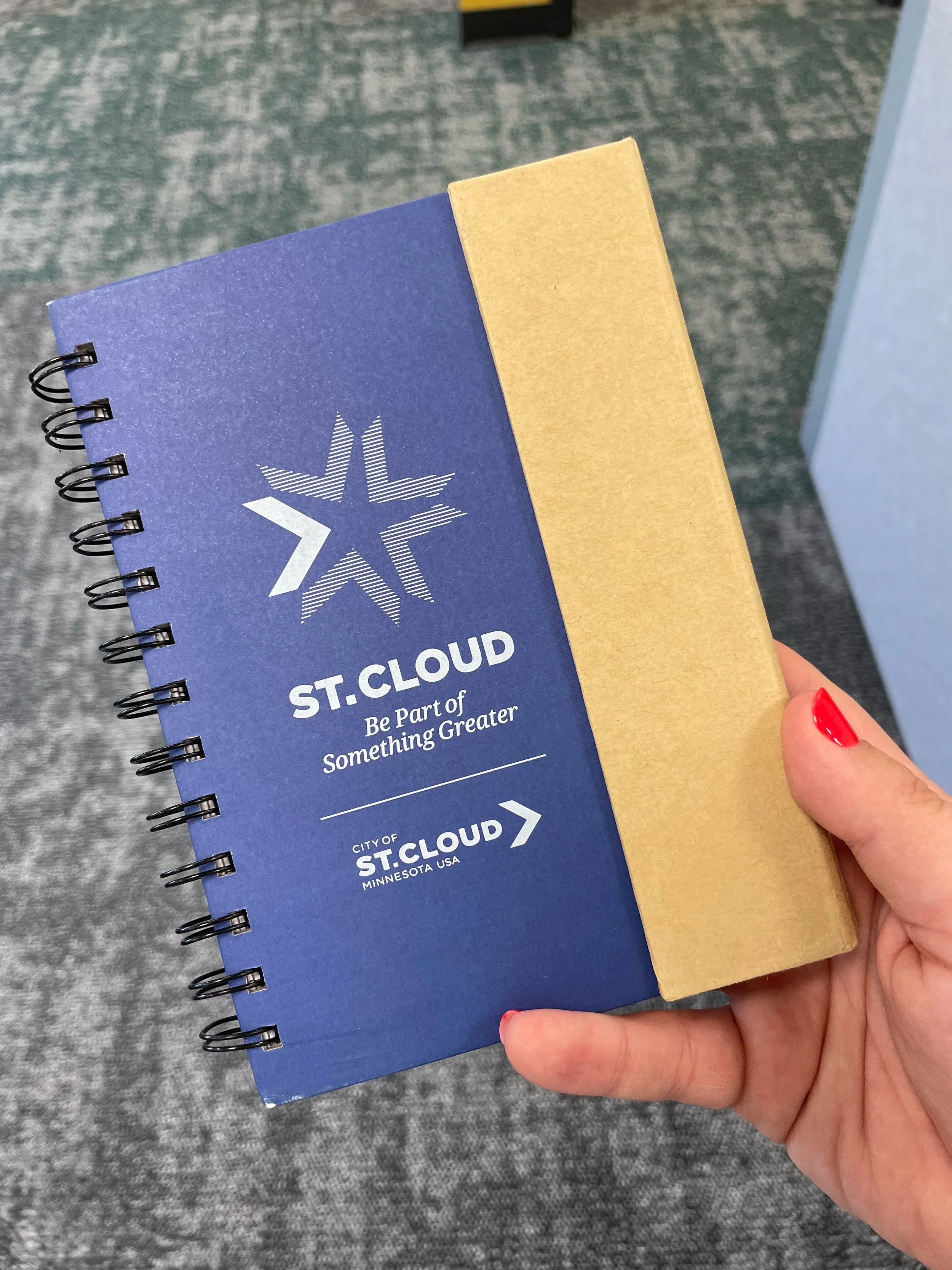
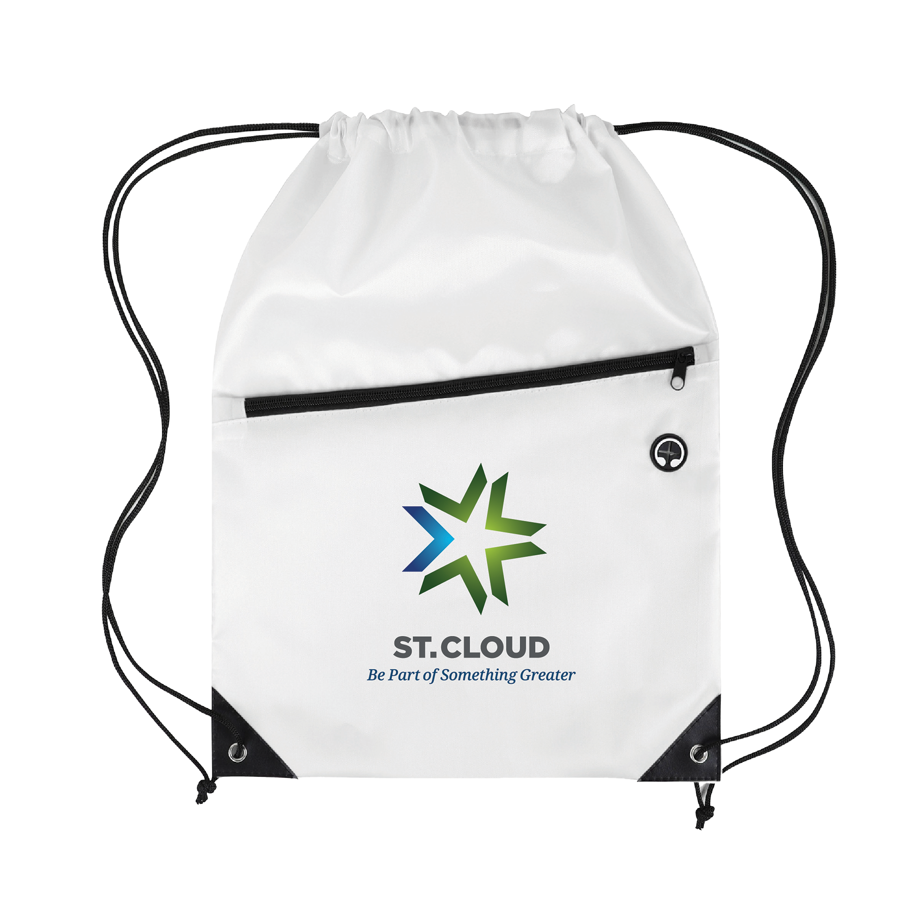
As the campaign matured, Sparq evolved the identity further in partnership with Katz Advisors, launching the Be Part of Something Greater campaign. The original GREATER chevron gave way to a new Greater Starburst logo mark: neighboring chevrons circling outward into an energetic, multidirectional star symbol rendered in a gradient of greens and blues. Where the original chevron declared, the Starburst invited, asking businesses, site selectors, residents, and newcomers alike to find their place within something already exceptional.
The full campaign earned the American Society of Landscape Architects Placemaking Honor Award in 2017, recognition of what becomes possible when creativity, strategic thinking, and genuine community investment converge around a single, powerful idea.
Original GREATER Placemaking Campaign in partnership with landscape architects and planners The Lakota Group; Be Part of Something Greater Campaign in partnership with Katz Advisors; All in collaboration with the Economic Development Authority and the Mayor's Office.
DISCIPLINE
Placemarking, Brand Identity, Content Development, Art Direction, Exterior & Interior Signage Systems, Print & Digital Communications, Brand PromotionsSECTOR
Municipal/CivicAWARDS
GDUSA 2023 ✷ American Graphic Design Awards
Tnemec Tank of the Year 2017 ✷ 2nd Place ✷ St. Cloud GREATER Water Tank
American Society of Landscape Architects Placemaking Honor Award ✷ 2017

Turning civic pride into a shared identity.